Cream, Crimson and the Courage of Colour: Why Britain’s Picturehouses Shouldn’t Be Beige
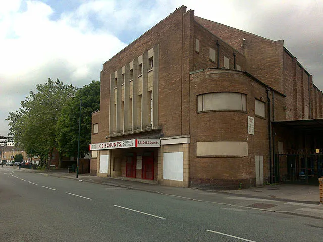
Photo: David Lally, CC BY-SA 2.0, via Wikimedia Commons
There is a particular shade of grey that has crept into British public buildings. It is the grey of a hotel lobby that does not want to offend, the grey of a meeting room with a plant in it, the grey of a developer’s brochure. It is not a heritage colour. And yet it keeps turning up in restored cinemas, as if the safest way to honour the past is to paint over it in something tasteful.
It is time to say it plainly: grey is not neutral. It is a choice. And in a picturehouse, it is usually the wrong one.
What the paint scrape actually says
Restoration architects and conservators do not guess at colour. They scrape. They take tiny samples from skirting boards, cornices, door frames and ceiling roses, then examine the layers under a microscope. A single patch of wall can hold the whole biography of a building: a 1930s cream, a wartime ochre, a 1950s pastel, a 1970s magnolia, a 1990s white.
In Britain, the evidence often points to schemes that were far more confident than we assume. Thirties super-cinemas frequently paired cream or stone-coloured walls with crimson, burgundy or bronze detailing. Art deco foyers used black, chrome and jade. Post-war picturehouses went in for mint green, primrose yellow and soft coral — colours that were meant to feel optimistic after years of rationing and repair. These were not accidental. They were designed to be noticed.
The argument for original colour is not nostalgia. It is evidence. If the paint analysis says the auditorium was cream with a crimson band at dado height, then a grey wall with a single heritage-blue poster is not a restoration. It is a reinterpretation with better lighting.
The pressure to be tasteful
Why does it happen? Money, risk and taste. A bold colour scheme costs more to get right. It demands custom mixing, specialist application and a willingness to let a room look unfamiliar. Modern design culture also has a horror of looking dated. Grey feels safe because it belongs to no decade in particular. But that is exactly the problem: a cinema that once belonged to the 1930s should not be made to look as if it belongs to a chain hotel.
There is also the audience question. Will people find crimson too much? Will pastel green feel childish? In practice, audiences tend to love colour when it is done with conviction. The discomfort is usually in the committee room, not the auditorium.
Cinemas that chose colour — and those that played safe
The best British examples are the ones where colour is allowed to lead. The Rex in Berkhamsted leans into its art deco identity, and the building feels confident because of it. The Plaza in Stockport understands that an opulent cinema is not embarrassing; it is the point. The Rio in Dalston wears its period detailing with a wink rather than a whisper. These are rooms that ask you to look up.
Elsewhere, caution has won. You can find restored picturehouses where the plasterwork is immaculate, the seats are comfortable and the walls are a soft, apologetic grey. They are pleasant. They are also forgettable. A cinema is not a waiting room. It is a place of anticipation, and colour is part of how that anticipation is built.
What audiences actually gain
Walking into a room that looks as it did on opening night does something odd and useful: it collapses time. You are not being told about the past. You are standing in it. The colour scheme is the handrail. It connects the building to the people who queued in 1936, who sat in the same dark, who looked up at the same crimson band while the newsreel played.
That is not a small thing. Heritage is often presented as a lesson. Colour makes it a feeling.
None of this means every restoration should be a riot of period detail. Some buildings have lost too much evidence. Some budgets cannot stretch to specialist finishes. But where the paint scrape gives you a clear answer, the default should be to follow it — not to sand it back and reach for the grey.
A picturehouse was built to be a bit of a show-off. Restoring one should not be an exercise in apologising for it. Cream and crimson, mint and primrose, black and chrome: these are not indulgent choices. They are the building’s own voice. Let it speak.